For as long as I can remember, the web has improved year on year at a stable but glacial pace. 2022 is different. It's the culmination of process changes and browsers working together more modularly.
2022 is the first year in memory that not only a single major technology ships, but a whole host of powerful technology. The result feels significant.
You see—the web typically moves slower than the 'app' world. But over the last few years, browser vendors—like Chrome, Safari, and Firefox—have been shipping behind experimental 'flags' that have enabled a more modular and faster approach to pushing out new tech.
What does this mean? These new technologies mean more expressive websites, from “scroll-linked” animation to eloquent magazine-like grids and sub-grid layouts.
This new tech is not only exciting for web developers but also for clients and, well… everyone who uses the web. For the rest of the article, I will be running through upcoming technology releases and translating what they mean into plain English.
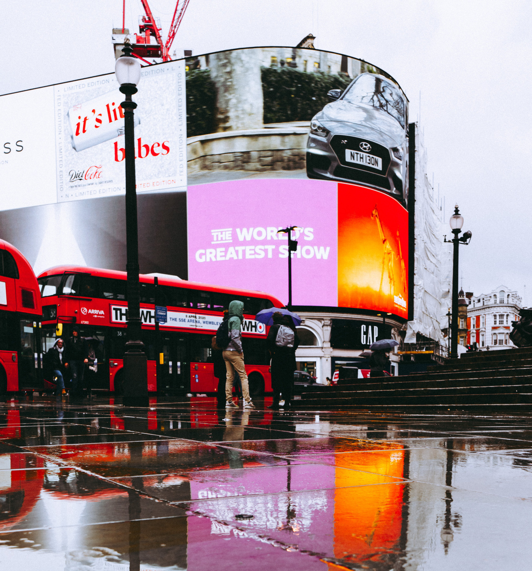
Think of the modern, vibrant Picadilly Circus curved display vs the washed-out 80s mess of old. This is how good a P3 website feels.
A specification set to release in 2022 called Colour Functions will allow developers to make websites literally 26% more colourful. Access to these colours mostly means we can make websites look much more rich and attractive.
If you're of a certain age and have ever dealt with a web developer, you might remember years ago web developers needed to design in “web-safe” colours.
At that time most consumer computer monitors could only display 256 colours, so if you designed in a broader range, most users wouldn't see the full spectrum of colours.
Colour Functions are kind of the same thing, except this time it's internet browsers holding things back, not monitors.
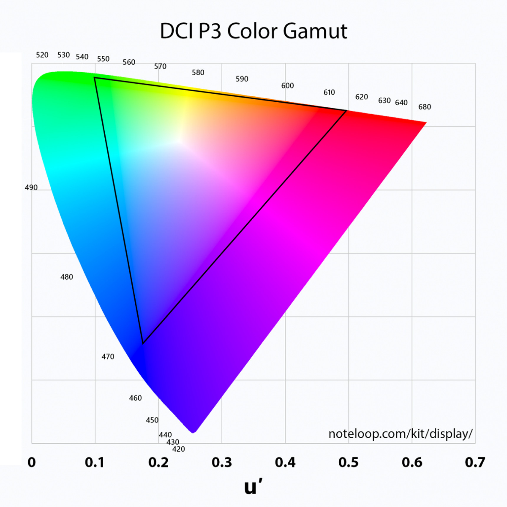
At the time of writing, most browsers can only access the "sRGB" (standard Red, Green, Blue) colour space, which is limited to a certain amount of colours.
There's a newer standard, known as the P3 (Protocol 3) colour space, where modern monitors and laptops can access a much richer range of colours.
The inner triangle here shows colours available to the sRGB colour space. The vibrant colours you see outside this are only available to P3 screens.
P3 colours look stunningly rich compared to standard RGB colours. If you're wondering just how good, you can see P3 colours if you open up this demo in Safari (which at the time of writing is the only browser that supports P3).
If you can see all four spectrums (display-p3, lch, and lab), it means you have a P3-capable browser. If you can also notice a difference between the colours, it means you have a modern screen capable of displaying colours in this expanded spectrum.
Once all browsers support P3, web designs will gradually start looking a lot more vibrant and attractive as web developers start implementing P3 colours in designs.
I'm already looking forward to making my neon-infused black/white/blue website look 26% hotter.
Page Transitions
Page transitions make websites feel more like ‘apps’
I'll be honest; this probably shouldn't be in here since I doubt it will “officially” ship in 2022. However, it is currently available, fully working, in an experimental version of Chrome. I wouldn't include this lightly, but it's just so relatively huge that I couldn't resist.
What are page transitions? Imagine you're on a hotel-booking app, and you click a thumbnail image of a hotel. In the next moment, information will probably slide across from the right, or maybe the hotel thumbnail will enlarge to fill the screen in one smooth motion.
You've just experienced a “page transition”—moving from one state (or page) to another in a smooth transition.
Page transitions are one of the few things that separate websites and 'apps'—apps providing a significantly smoother experience in this case.
We go from one page to the next on the web in “pop” movements without any kind of soft landing.
Transitions, on the other hand, are not only smoother and more visually appealing, but they also show us where we're going. Think of all the animations on your smartphone; when you flick up from the bottom of a screen on an iPhone, iOS shows you what happened in one smooth movement.
For web developers, native page transitions could bring us one step closer to confidently saying to clients, “you probably don't need an app”.
For what it's worth, an older colleague (sorry, Dean) pointed out that we were here decades ago with Internet Explorer 5.5. That obviously didn't last, but I hope this time is different now that we have better browser standards and collaboration between browser vendors.
Scroll-linked Animations
With scroll-linked animations you can smoothly animate anyting you want based on the user's scroll position
Animating based on a user's scroll position is nothing new on the web.
Just about every client meeting I've had in the last few years can't end until a client smiles knowingly and asks for "parallax" effects.
However, implementing anything scroll-related has always been a bit hamfisted. You'll need to use some sort of script plugin to continually track where the user is on a page. The browser always struggles a little with this kind of stuff. Until now! (or the near-future, at least).
On the horizon is a “native” implementation of scroll-linked animation. “Native” means that the browser has it baked in so that you don't need to load a plugin.
Don't be fooled—this is not just developer convenience. Anything “Native” (baked into the browser) means performance will be significantly better and programming significantly simpler, leading to a much smoother and delightful implementation.
Systems and Components / not Pages
Historically we've designed websites like pages rather than what they really are: a collection of interlocking and contextual patterns (like Lego). This is about to change with the introduction of Container Queries.
I remember the vast mental shift that Responsive Web Design brought in the 2010s.
If you don't know what I'm talking about, Responsive Web Design was both a mental and technology shift to designing websites that worked on all sorts of different sized devices.
In the simpler days of web development, you'd just design a fixed-width page. With the advent of Responsive Web Design, we could suddenly query the device width. Developers started designing flexible layouts that could adjust to mobile phones, tablets, and various screen sizes.
Intrinsic Web Design
The web will always be an inherently flexible medium. Your website can be literally accessed by thousands of different device types with wildly different capabilities. Someone could access your site on anything from a computer at CERN, to a 2008 Blackberry, to a high-specced 2022 MacBook Pro. Layout and design need to be flexible and adjusted accordingly.
So what follows Responsive Web Design? 4 years ago, Jen Simmons gave a talk called Everything You Know About Web Design Just Changed. This was around the time web developers got access to modern layout models—namely CSS Grid and CSS Flexbox—two incredibly powerful layout technologies that enabled all sorts of wonderful Graphic Design-like layouts.
Fast-forward to 2022, and we're about to get something called Container Queries, which are the crowning jewel we've been waiting for in this era of new layout technology.
Container Queries allow web developers to query the surrounding space of the component. Querying contextual space was never previously possible. Instead, you had to query the area of the whole page. As container queries are released, we can design components that adjust based on context.
Jenn Simmons has suggested a new name to mark this paradigm shift: Intrinsic Design—which indicates that we're designing inherent systems rather than pages.
Web developers have been asking for this sort of expression for years to reflect the truly modular nature of designed components, allowing for more robust designs. Imagine brand guidelines for different components, where you can specify how things will look depending on the space available to them? The Responsive Logos project comes to mind.
Grids and Subgrids
I hope new layout systems encourage more creative, artistic, and unusual designs
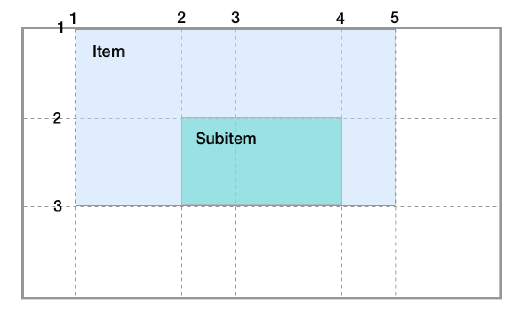
A few years ago, we had (CSS) Grid—a layout technology designed to give developers grid-like control over where designed objects were placed. Think of magazine-style layouts where designers place different arbitrary columns to create unusual artistic designs for feature articles. A few years later, we're on the cusp of “Subgrid”—a way for us to nest interesting design components inside a grid layout while still accessing the external grid references. It's a difficult concept to grasp, but the below image might give you a clearer idea.
This diagram from a Smashing Magazine article by Rachel Andrews gives you an idea of how a subgrid can be nested inside its parent
Previously where developers had needed to program complex layouts, they would do so with some sort of hack that may technically work brittlely, requiring extra code to handle edge cases.
Subgrid means developers can create a much more robust design ecosystem, allowing for more complex designs that stand up to the scrutiny of the ever-growing list of different screen sizes and devices.
Further Reading
I've tried to highlight the most visually understandable browser technology changes in this article, without making it too long. Still, the reality is there are far more technical things on the immediate horizon that only developers—including me!—are excited about.
I've listed more new technologies below to give readers an idea of how much is happening in the web browser space. 2022 is probably the best time there's ever been to be involved in web design and development.
For more technical reading including the below, I'd recommend Bramus Van Damme's blog post on CSS in 2022.